Dropbox - Lumion file: https://www.dropbox.com/s/zn4gitbiebcb2j5/Final%20Light%20Rail%20Stop.ls6?dl=0
The Architects
Peter Zumthor is a minimalist and modernist. Mies Van Der Rohe is also a minimalist who showcase the beauty of simplicity in his work. Peter Zumthor's works focus on the texture of the materials and explore the tactile and sensory qualities of spaces and materials. He creates a dynamic atmosphere in his work by applying natural light and shadow. In his work, there is a clear distinction between exterior space and interior space, which is different to Mies Van Der Rohe's work. Mies Van Der Rohe uses a lot of glass and steel in his works. The glass facade dissolves the boundary between inside space and outside space. People can see through the whole building easily. However, two architects also have similarity. They both use natural material such as stone and rock in their work. The use of natural material allows them connect their work with natural environment.
The Theme
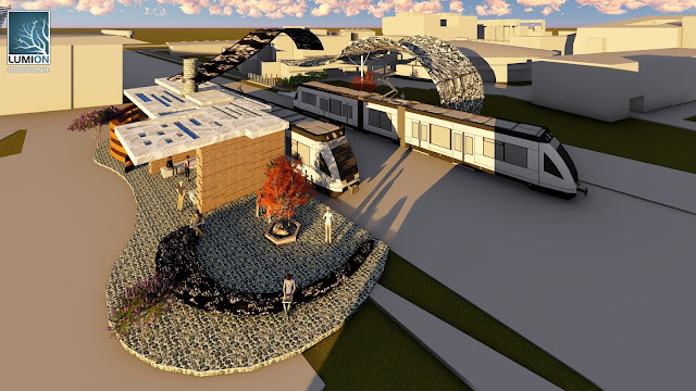
The theme that I choose is ''Diversity". As UNSW has diverse students and staff from different cultural backgrounds, I aim to design a place to create a harmonious atmosphere for diverse people to communicate and promote their understandings for each other. The light rail stop that with the curving shape creates a very open platform for people to have conversation while waiting for the tram. I think a open place can always influence people's mood, for example people will feel less trapped and more willing to talk. The light rail stop that at the opposite create a more peaceful atmosphere. With the small space between each walls, people are able to sit closely and talk. There is a long bench sits in the mini garden in the stop, which is also encourage people to sit down and have a delightful moment.
The 2 Concepts
Peter Zumthor - Outside and Inside: A clear distinction
Mies Van Der Rohe - Minimum division between building and natural environment
In my design, I focus on the contrast between two concepts. The light rail stop with a curving shape is response to Mies Van Der Rohe's concept. It is a very open platform which reveals its interior space maximally. Even though it is a light rail stop, people inside the stop can feel as if they are in the outside because of the boundary between inside space and outside space is so weak.
The opposite stop showcases the concept from Peter Zumthor. There is a clear distinction between inside space and outside space. Each space is clearly divided by the stone wall.
 |
| This is a really open space which people can see through it directly. The boundary between inside space and outside space is almost zero. |
Custom textures
Light
Medium
Dark
The prototype that I based on:
Reference:The tram model is from the 3Dwarehouse.


No comments:
Post a Comment